I may regret that title. I’m sure that it will attract a number of readers expecting something a bit more exciting. Sorry to disappoint but this post is not about watching free porn. It’s about correlation and causation.
I came across an interesting graph of GDP versus belief in evolution on the Calamities of Nature website. Of course one cannot assume any causation based on correlation but it’s interesting to go through the exercise of comparing different categories of data sets. Google continues to provide tool sets that make this exercise not only interesting but easy.
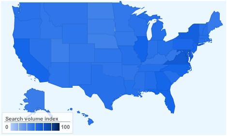
Building off of the Calamities of Nature concept I used Google Insights to inspect search volumes for various search terms. In addition to a numerical output a heat map is generated showing the density of terms by state. For example, searching for a widely known term such as “Obama” returns a heat map with near uniform density indicating that no state has a greater volume of searches than another. The map below is the last 12 months of Google searched for “Obama”.

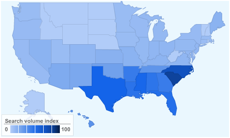
Now for the entertaining part. What is the appearance of heat maps for Google searches for “godly” and “watch free porn”? I leave you to draw your own inferences from the following charts.


On a tangential observation, using Google Insight can lead to interesting and unexpected observations. Not surprisingly, the heat map below shows Google searches for “fire ants” to be focused in the Southeast where most of the pesky creatures live. The second chart shows the search volumes over time. Notice the annual bimodal distribution. Although I’m no entomologist it only took a few minutes of searching to discover that fire ants are most active in fall and spring when daytime temperatures are between 70 and 85 degrees Fahrenheit. The search distribution matches this fact rather closely.

 Google Insight is an interesting tool for data discovery but it is always prudent to remember the inequality between casual and causal relationship.